Visualizing The Field: Exploring the Full Space of Schelling's Segregation Model with 3D Manifolds #
Thomas Schelling's segregation model is one of the most powerful demonstrations of how simple individual preferences can lead to complex, emergent social patterns, while maintaining believable and simplistic rules for individual agent actions. This project looks to examine how successful different Machine Learning methods can be in predicting the nonlinear relationships between agent-based modeling hyperparameter inputs and measured outcomes across the entire model space in a computationally tractable way.
A simplistic explanation of Thomas Schelling's agent-based model simulates how individual preferences for similar neighbors can lead to large-scale segregation, even when agents only mildly prefer a majority of their neighbors to share their characteristics. Using a grid-based system, the model shows that small tolerances for diversity can result in stark clustering and spatial separation over time, illustrating how macro-level segregation emerges from micro-level decisions. A more thorough discussion of the model itself can be found at (throw a link here).
This project is based on Adil Moujahid's Python-based implementation of the Schelling Segregation model written to visualize in Streamlit: blog post and source code on GitHub.
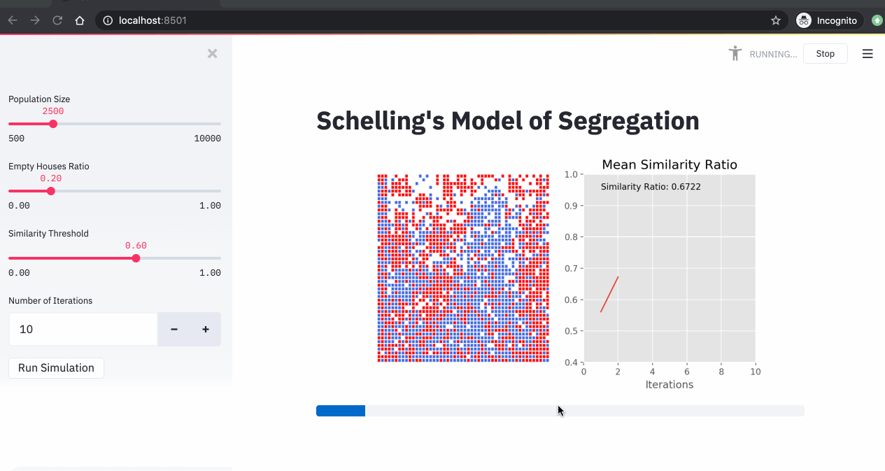
A simulation of the Schelling model showing agents moving to find neighborhoods that meet their similarity preferences.
Emergent Behavior and ABMs #
What makes Schelling's model so compelling is its counterintuitive result: even when individuals have only mild preferences for similar neighbors, the system can evolve into highly segregated patterns. My implementation explores this phenomenon across 9,801 different parameter combinations, creating a comprehensive map of segregation dynamics.
Key Model Parameters #
- Empty Ratio: The proportion of empty cells in the grid (0.01 to 0.99)
- Similarity Threshold: The minimum proportion of similar neighbors an agent requires to be satisfied (0.01 to 0.99)
- Grid Size: 50×50 grid with 2,500 cells
- Neighborhood: 3-cell radius around each agent
- Iterations: 15 rounds of movement
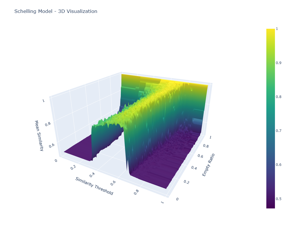
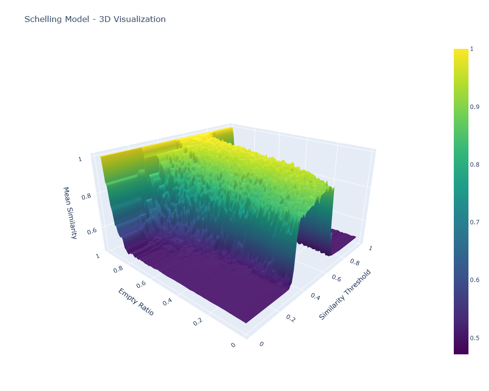
3D Visualization: The Segregation Manifold #
The 3D visualization maps the relationship between model parameters and outcomes; by plotting the empty ratio hyperparameter against the similarity threshold hyperparameter, with the dependent variable, mean similarity, as the z-axis, we can see the "segregation manifold"—a mathematical surface that captures the quantified level of segregation across the full space of possible input variable mixes.
 Click either image to open the interactive 3D visualization (HTML).
What the Manifold Itself Reveals #
The 3D surface tells us a couple of things:
- Phase Transitions: There's a sharp transition zone where segregation patterns emerge rapidly as similarity thresholds increase at around 0.4 (a preference for at least 40% of one's neighbors to be similar), and segregation actually falls again at higher similarity thresholds of 0.65. This paradoxical effect is likely due to agents being completely unable to coalesce owing to constant movement from low-similarity neighbors. No homogeneous core is created, and thus no agglomeration is precipitated out of the heterogeneous mix of agents. Interesting, but not related to the actual research question here.
- Empty Space Effects: Extremely high empty ratios create high mean similarity. Unsurprising. In empty worlds, you can pick your neighbors quite freely.
- Nonlinear Dynamics: The relationship between parameter mixes and outcomes is nonlinear, with steep gradients in certain regions and phase-transition behavior. This is important to the research question. Are there computationally tractable ways to compute or predict full manifolds accurately given that they show these nonlinearities and phase-transition regions?
Technical Implementation #
This project showcases several potentially useful techniques for academic research in agent-based modeling:
Distributed Computing with Modal #
To generate the full evaluation dataset (both for training and for benchmarking ML), I ran the entire 99×99 grid of parameter combinations on Modal. The implementation in streamlit-schelling/schelling_modal.py defines a Modal app and a function:
import json
import numpy as np
import modal

app = modal.App("schelling-simulation")
image = modal.Image.debian_slim().pip_install(["numpy"])

@app.function(image=image, cpu=1, timeout=600)
def run_simulation(params):
    empty_ratio = params["empty_ratio"]
    similarity_threshold = params["similarity_threshold"]

    # ... initialize grid/world ...
    # ... run the Schelling model for a fixed number of iterations ...
    # mean_similarity = ... compute final mean similarity ...

    return {
        "empty_ratio": float(empty_ratio),
        "similarity_threshold": float(similarity_threshold),
        "mean_similarity": float(mean_similarity),  # computed above
    }

@app.local_entrypoint()
def main(output_file="data/schelling_res_var_outcome.json"):
    # 99×99 grid at 0.01 resolution
    empty_ratios = [round(x, 2) for x in np.arange(0.01, 1.00, 0.01)]
    similarity_thresholds = [round(x, 2) for x in np.arange(0.01, 1.00, 0.01)]
    params = [
        {"empty_ratio": er, "similarity_threshold": st}
        for er in empty_ratios
        for st in similarity_thresholds
    ]

    # Massive parallelism: one simulation per param combo
    results = list(run_simulation.map(params))

    # Save for visualization and ML
    with open(output_file, "w") as f:
        json.dump(results, f, indent=2)
The local entrypoint constructs the grid at 0.01 resolution for both empty_ratio and similarity_threshold (9,801 runs total) and can save a metadata-rich file (schelling_results_metadata.json). For visualization and ML, I use the outcome-only dataset already in the repo at streamlit-schelling/data/schelling_res_var_outcome.json with fields:
empty_ratio∈ [0.01, 0.99]similarity_threshold∈ [0.01, 0.99]mean_similarity(final mean after 15 iterations)
The scripts/visualize_results.py script pivots this into a 99×99 matrix and writes the interactive plots referenced above (schelling_visualization.html, schelling_3d_plot.html).
Machine Learning Analysis #
Goal. Learn f(empty_ratio, similarity_threshold) → mean_similarity from a sparse subset of simulations and accurately reconstruct the manifold.
What’s implemented: The ML pipeline lives in streamlit-schelling/ml_classic.py and uses XGBoost with Latin Hypercube sampling on the 2D input space:
- Data: loads
data/schelling_res_var_outcome.jsonand uses features[empty_ratio, similarity_threshold]with targetmean_similarity. - Split: randomly divide the full set into two halves (A/B). Within each half, choose training points via LHS by mapping design points to nearest actual grid points; evaluate on the held-out portion of the same half and also on the other half.
- Model:
XGBRegressor(n_estimators=100, learning_rate=0.1, tree_method="hist", eval_metric="rmse", random_state=42). - Artifacts: per-run metrics.json, evaluation plots (true-vs-pred, residuals, feature importances), and interactive Plotly overlays (true vs. predicted surface, absolute error surface). A consolidated CSV is saved at
evaluations/xgboost_half_split_lhs/summary_results.csv.
Results (from summary_results.csv). Across train fractions of 25%, 50%, and 75% within a half, the model achieves:
- Test R² on same half: ≈ 0.985–0.987 (RMSE ≈ 0.023–0.031)
- R² when predicting the other half: ≈ 0.981–0.988 (RMSE ≈ 0.022–0.027)
Errors concentrate along the phase-transition ridge in the manifold (rapid changes around mid-range thresholds), while the bulk of the surface is fit tightly—typical for ABMs with thresholded dynamics.
Reading the figures.
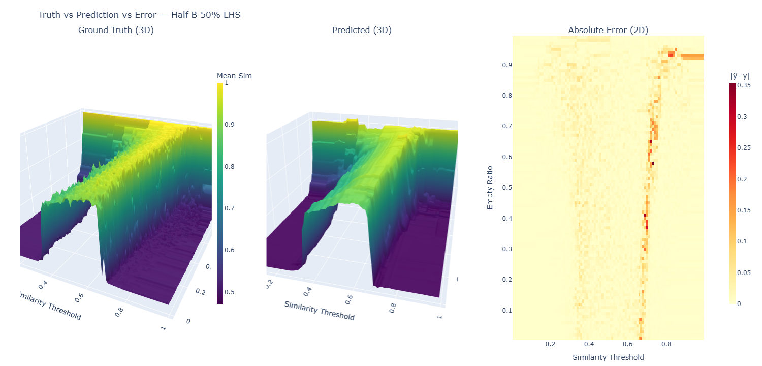 Click to open interactive small-multiples view: left is the true manifold, middle is the XGBoost prediction, right is the absolute error heatmap. Pan and zoom each panel independently.
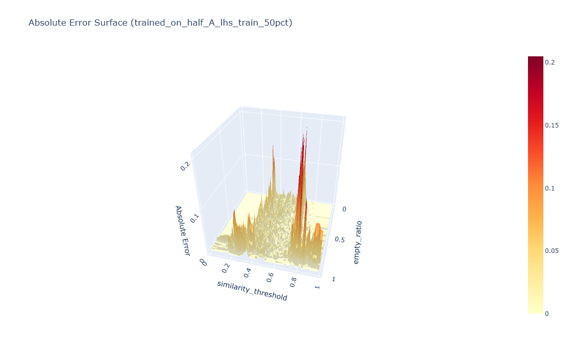 Click to open interactive absolute error surface: a 3D view of |ŷ − y| highlighting where the surrogate struggles (the phase-transition ridge). Rotate to explore different perspectives.
Implications: Tree ensembles handle the heterogeneous, mostly smooth regions well and struggle near discontinuities. Two natural extensions:
- Uncertainty-aware surrogates (e.g., GP or bootstrap/jackknife over trees) to flag where to simulate next.
- Active learning on the ridge: iterate between training and targeted simulations instead of sweeping the whole grid.
Code and Data #
The complete implementation is available on GitHub, including:
- Modal-based distributed simulation code
- Interactive visualization scripts
- Implemented: XGBoost surrogate training/evaluation (with artifacts under
evaluations/); planned: GP and active-learning loop